
Five colors so far, from left to right, Harbor Gray, Heritage Blue (it looked gray on the color swatch), Pewter, Slate, all Behr colors from Home Depot. The last a color I saw on Susan Cohan's blog, Sherwin Williams' Bohemian Black with, in Susan's words, "a decidely plum cast."
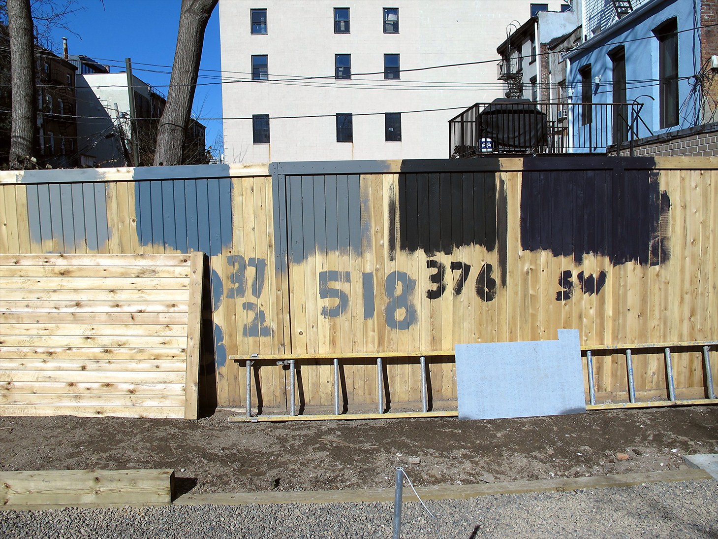
Harbor Gray ... too light. Heritage Blue ... too blue.

Pewter ... gets a maybe. Slate ... also a maybe. I really think I'd like to see something closer to my original idea of Charleston Green, though Les disapproves.
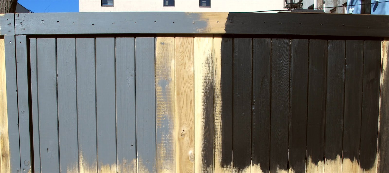
Slate again ... and Bohemian Black on the right. The plum cast is much more clearly evident in sunlight ... a good color for the right application, but I think not mine.
[After publishing this post, I've come back to make one additional comment. The black on the right above is the same black shown on the left below. The angle of light (the sun is off to the left behind me) makes them look like different colors ... much lighter below than above.]

So this weekend I'm getting Benjamin Moore's Salamander, a black green with a touch of olive, Behr's Forest (probably too green, though quite dark), and Sherwin Williams Charleston Green. It was interesting to find that, though Sherwin Williams no longer offers Charleston Green, the mix remains in their database of historic colors and can be made up at will.
I really think I'd like the color in the so-far anonymous garden image below, but I may never get it.

But is perfection necessary?
So many choices...and of course, hard to really judge in photos...my preference, I think, would be something between 518 and 376...but more neutral (no blue)...maybe even a tad "warmer" of a gray?
ReplyDeleteVirtually impossible to decide from photos. I think I'm with you on the color selection ... so far.
ReplyDeleteMmmmmmmmmh. Plum ! IMHO.But maybe I was just so taken with that phrase "Decidedly a plum cast"
ReplyDeleteAnd I do like (well love) the photo "anonymous garden image". If you want it you can get it. Many paint shops can have the device where they can analyse straight off the photo. And make that colour for you. (you can probably do it on your phone for all I know) Kerry
I think I can see the black with the "decidedly plum cast" in your dry landscape. It may pick up some of the sunset coloration (just my imagination of your landscape).
ReplyDeleteNever thought of that. It happens have painted all the ironwork here a colour called "Iron sand" Now you point it out it can be a bit plumish. Cheers Kerry
ReplyDeleteKerry, the brownstone (reddish sandstone) classically used for the facades of Brownstone houses in New York also has that "plummy" tone and picks up the light of sunset beautifully. That brownstone turned out to be a bad choice. It erodes in the city air, and owners have to spend small fortunes having artisans recreate all the Victorian detail.
DeleteIt will be interesting to see what the Charleston Green looks like. Will the wall of the new addition remain grey? The trick will be to find a shade that doesn't clash with it and the nearby buildings (I see dark brown, light yellow, blue, and a sort of cream) and the shade of your gravel. (God is really in the details with color.) I like "Slate" if you decide against really dark.
ReplyDeleteI'm looking forward to seeing the Charleston green, but with a bit of trepidation. Fact is, I like the color of raw concrete, and I'm entertaining another idea, which is to paint that wall a slightly warmer gray than it is, and use the same color on the fence. The colors of the gravel and slate paving would harmonize well with that, and it all would give me a rather "neutral" palette that would pick up the colors of the changing light and place emphasis on the plantings. I'm intrigued by an article on a Tom Stuart-Smith garden in Wiltshire in House & Garden that refers to "a bone-grey color that absorbs the light." Of course, I'm not Tom and this garden is in urban Brooklyn, not a beautiful site in Wiltshire along the River Avon. No decisions on that now; I have to try the other colors and let the impressions "percolate."
DeleteOur walls ARE raw concrete. The colour varies slightly depending on the batch of sand they used. (Very downmarket tight budget) Inside walls are painted bleached lichen, which is a gentle taupe, echoing the concrete and aluminium fittings.
DeleteI thought you said those gold handles had to go? Blackish-green otherwise known as licorice.
Oh, for concrete walls ... not wood. I discovered those gold handles are brushed nickle, the right color after all. The gold was an optical illusion caused by reflected light near sunset.
DeleteIsn't the issue whether you want to be noticing the colour or having it recede as a background?
ReplyDeletePerfection? Yes if it is possible. Certainly perfect enough for you not to be continually irritated when you look at the garden!
XXXXX
Good advice. I certainly don't want to choose some dramatic color that I decide I hate in two months. Makes me want to move toward safer neutrals. Perhaps the long decision-making process speaks for itself, and I should go with first impulse.
DeleteIf I may make a suggestion, the green in your picture looks very similar to the Farrow & Ball "Monkey Puzzle" green (238), or maybe the old "Carriage Green" (94). I think the "Monkey Puzzle" might be exactly what you are looking for. I think both of these colors are archived now, but you can still order them. I suggest you order sample pots and if one is close enough, take it to Sherman Williams and have them try to color match it.
ReplyDeleteThanks for that information, Susan. I may take you up on it if I can maintain the energy of the search. I'll Google those colors now (though I know a computer screen is no way to judge.
DeleteI Googled these colors myself, an it looks like the "Carriage Green" or the currently available "Studio Green" is closest to the black-green you are looking for. The advantage of the "Studio Green" is you should be able to go into the F&B store in NY and see the color in person or pick up a sample pot.
DeleteSusan, I really want to thank you for doing all this research. I just checked and, according to their web site, F&B has a store on Mercer Street in Soho, not too far from here. Wonder if they're open President's Day.
DeleteWhatever your final choice is, if it makes you happy, it has my approval.
ReplyDeletePutting words in your mouth, huh? I should be more careful.
ReplyDeleteHello there,
ReplyDeletetry mixing the slate with bohemian black.....might just do the trick?
A friend of mine had (too flat a shade of) black fencing in a similar-sized courtyard. The planting glowed against it, like the old auricula theatres.
But a softer black, with a bloom like a plum, would've been better still
I find my thoughts about color evolving. I tried three new colors yesterday, all three very dark greens, one, Charleston Green. In a garden surrounded by trees or in a woodland setting, I think the dark colors would work very well. I love them. But when I think of sense of place, the place in this case being the inside/backside of a Brooklyn block, other colors are more appropriate, not just because they contrast less with the surroundings, but because they seem more appropriate to the reality of the place in which I'm making the little garden. Of course, sense of place might very well call for dramatic contrast. So I'm still up the tree on this one. Anne Wareham's advice lingers, though. I don't want a color I'll come to hate looking at.
ReplyDelete... still on the edge ...
Hello James,
ReplyDeleteWell, then, we must all try to push you over! You seem drawn to the blacks, I like them too, especially if paired with a red plaster wall.... It seems from your photographs, though, that the most important act is to block the view of neighbouring windows at the back of your little garden. Ross
Ross,
ReplyDeleteAha! So push me over ...
Your comment reawakens my dreamy island garden. Perhaps what unkempt Brooklyn backyards need is a bit of magic, if I can manage that. A Prospero in the burg. That red wall may have to be made of marine plywood, at least initialy. And I have an old, leaky, vaguely lotus shaped fountain I could plant with mosses and similar things, placed on axis with the pool, of course. I have a large bed of boxwood and bergenia out in the country garden, very lush; that might make a model for planting around the wall. Thank you. And good to see what you look like (the photo is new, no?)
Hello James,
DeleteWhile I love the idea of a folly at the back, my suggestion (of a red plaster wall) was for your kitchen addition -- you need to think about that as well? Neapolitian colors. And if you kept to it in planting, your red, black and green garden would also be the colors of Palestine: horticultural solidarity!
Do you know Roy Strong's book (before the Sir) on Small Gardens? Very well done. Also, you might take a look at "Good Olde Things" on 125th in Harlem for overpriced salvage. They had a number of lovely eight foot high gates (from the old estates) of nineteenth century ironwork, to make a man swoon.
Daffodils are out in Morningside Park (where there is also an astonishing crabapple which has kept all of its fruit over the winter -- I wonder if you or some of your friends might know the variety, as it is very beautiful).
Ross,
DeleteYour comment took me by surprise. We were thinking very different things. Red for the back wall of the new addition would be too much red for me. I think (in fact, am sure) I'm repeating myself when I say I have a circle of red logs in the country garden, and I do love the complementary green and red. That's one reason I was thinking about a geometric red shape at the back of the garden, surrounded by greens. No matter, I'm afraid. I found a workman painting the back wall this morning. A pretty taupe color. This was also a surprise. I didn't remember the contractor was supposed to paint the wall!
I have Roy Strong's The Laskett, about the garden he and his wife made, but have never seen his book on small gardens. Though from what I've seen of The Laskett (the garden itself), I think our tastes are a universe apart. Architectural salvage from Good Olde Things isn't in my budget either, since this new addition will cost approximately twice our expectations. Not a good thing to be doing going into retirement, which I'm working on. Crabapples, yes, I do love the ones with gobs of fruit that lasts through the winter. I'd like one in my garden, but can't find the space. Morningside Park must be beautiful in this early spring. I saw hyacinths and snow drops up next door today.
I'm drawn to the darker blacks James, green looks so good against them.
ReplyDeleteMaybe a lighter blue/grey would be a bit more seamless, but again, I'm looking at the anon. bottom garden photo and love the foliage against the darker colour.
I look forward to the 'green' post so as we can all further complicate the issue, ha, ha.
Rob, I tried three dark greens--one is Charleston green, almost black. I'd just about given up on posting colors because they are so "untrue" in photos, but I may as well finish what I started. So probably tomorrow, if time permits.
DeleteJust my .02--For me, the black-greens strongly evoke a sense of place. A place that has blue hydrangeas, delphiniums, antique red brick and a tricking Greenman fountain on the wall--courtyard gardens of Washington DC, Charleston. Not so much NYC. Other than this, I think they are lovely. I look forward to seeing the next round of paint samples. Are you thinking that the value should be more moderate, or the hue, or both? To date, my favorite sample was the slate although the brown cast seems quite strong (especially in the first photo), and I thought it might be easier on the eyes if it were grayed down a bit. I definitely think you should keep on throwing paint at the sample wall until you get it right! But, maybe you could use a sample board instead? Doing so would allow you to observe the sample in different lights and wouldn't pose as big a hassle for painting over.
ReplyDeleteEmily
Emily, yes, urban gardens have had to be oases, hidden courtyards, for thousands of years, so plenty of precedent exists for making a garden that doesn't "blend in." I believe I want a color that gives substantial contrast in value between the walls and the plants, so, yes, a difference in value is certainly one thing I'm looking for, even with the dark hues. You're right about using the fence for testing, of course, because I need to sand through the test patches before applying the final stain. Too bad I didn't think of that before! Another issue is the quality of the fencing. I found the best I could in a rather quick search, and cost was a major factor, but the workmanship is almost nonexistent. Finishes are very uneven and rough, staples and gashes mar the surface, and some stains bring out the imperfections more than others. See my response to Ross Hamilton's comment above. I think I'm aiming for something very different, a private space with its own sense of place, not necessarily relating to much around it.
DeleteWe call that shade of green "grachtengroen", or canal green here. Haven't read all the comments, so I'm not sure if you you've made a decision already but have you tried Farrow & Ball? I often use there colors as my basis (often getting the paint supplier to make the color in a less expensive brand of paint - shhh, don't tell).
ReplyDeleteDecision made long ago. I used Slate from Home Depot, and a year later I still like it. Actually, someone else recommended Farrow & Ball. I like that name: grachtengroen. Wonder how you pronounce it?
DeleteJames, would you mind sharing whether you chose the Behr "Ultra Flat" or the "Satin" finish? I am also putting in a black fence and trying to decide on sheen...Yours looks just perfect. Thanks! Rachel (also in Brooklyn)
ReplyDeleteRachel, I can't remember. I used an opaque stain, not paint. I don't believe it's offered in those two finishes. I have a gallon left, and there is no indication as to a finish. If I had to guess, I'd say Ultra Flat.
ReplyDelete